Data Products


Web Applications with Shiny

Water Quality App

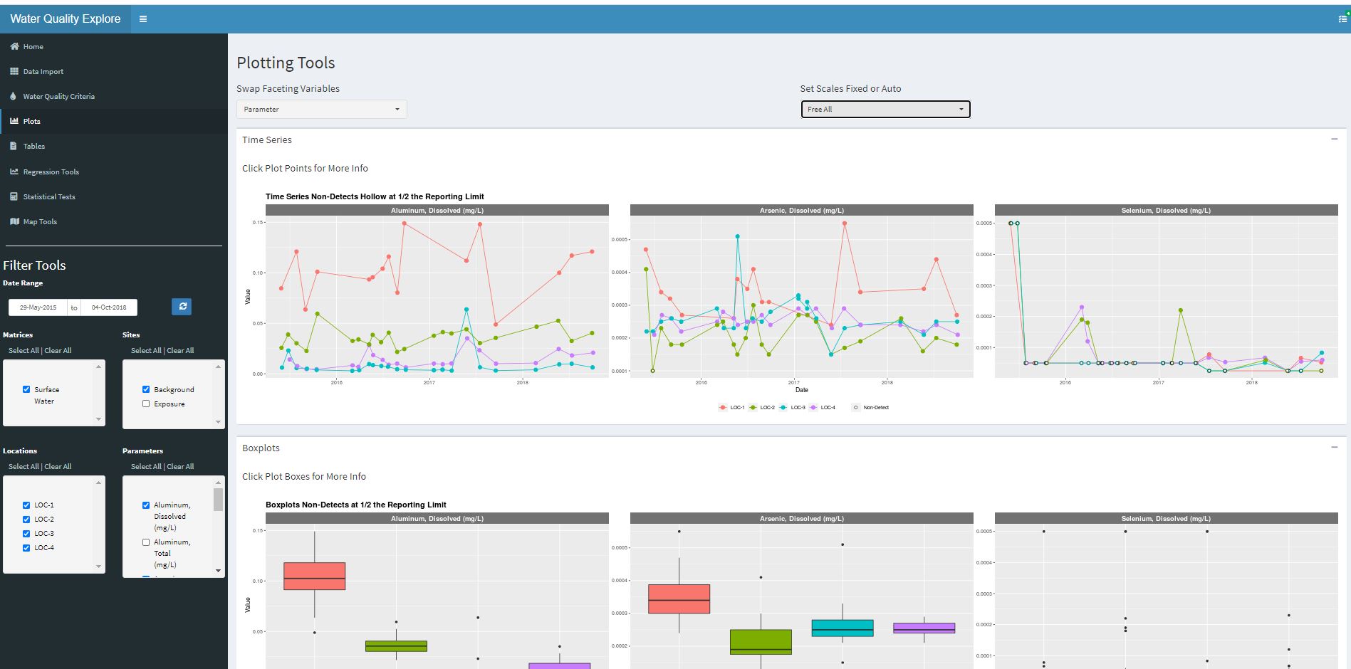
Try my R Shiny App for exploring environmental datasets. Follow the link, hit the “Load Demo Data” button, pick a few locations and analytes from the left side, and explore the demo data.

Try my R Shiny app…

My Demo Data Explorer App

Visualizations

Any common analytic visualizations can be created as images or PDF files, for insertion into a presentation, a document or to put in an appendix.

Any kind of plots, too many to show. Histograms, scatter plots, bar charts, box plots, piper diagrams, stiff plots, heat maps, contour maps, bi plots, pies, control charts, radial charts, bubble….

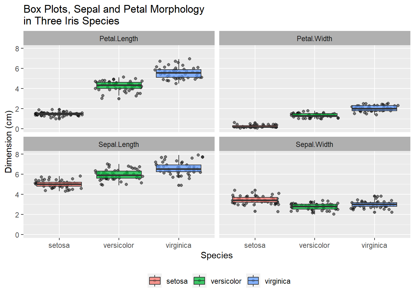
Box or Violin Density Compares Variables between Groups

df<-iris %>%
  gather(Parameter,Value,1:4)

ggplot(df,aes(Species,Value,fill=Species))+
  geom_jitter(alpha=.5)+
  geom_boxplot(alpha=.75)+
  facet_wrap(~Parameter)+
  theme(legend.position='bottom',legend.title=element_blank(),
        strip.background = element_rect(fill='gray69'))+
  labs(y="Dimension (cm)",title="Box Plots, Sepal and Petal Morphology\nin Three Iris Species")
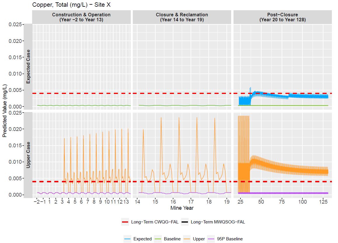
Time Series/Grouped Time Series Depict Change through Time

GoldSim model output for two modeling scenarios, over the three expected phases of mine operation.
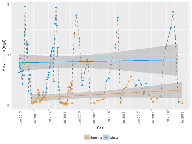
A look at molybdenum concentration behavior by season.
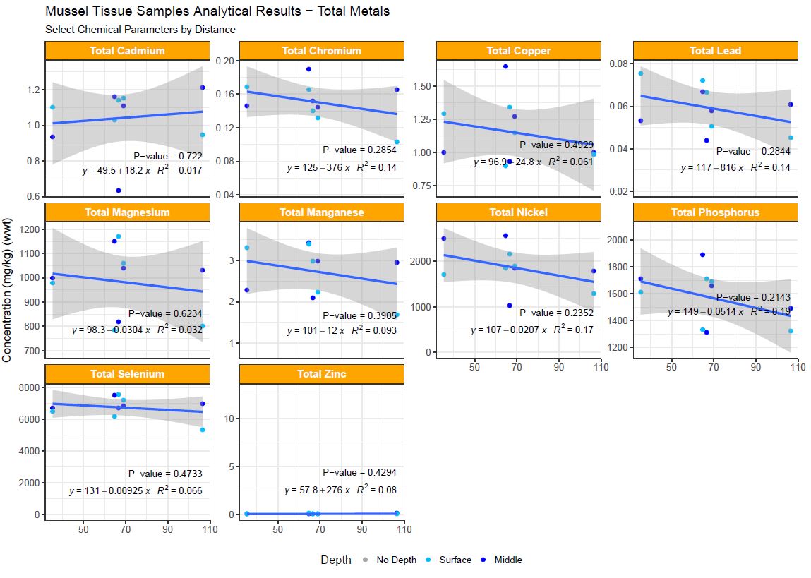
Regression reveals Correlation between two Variables

Marine mussels tissue contaminant as a function of distance from the source.
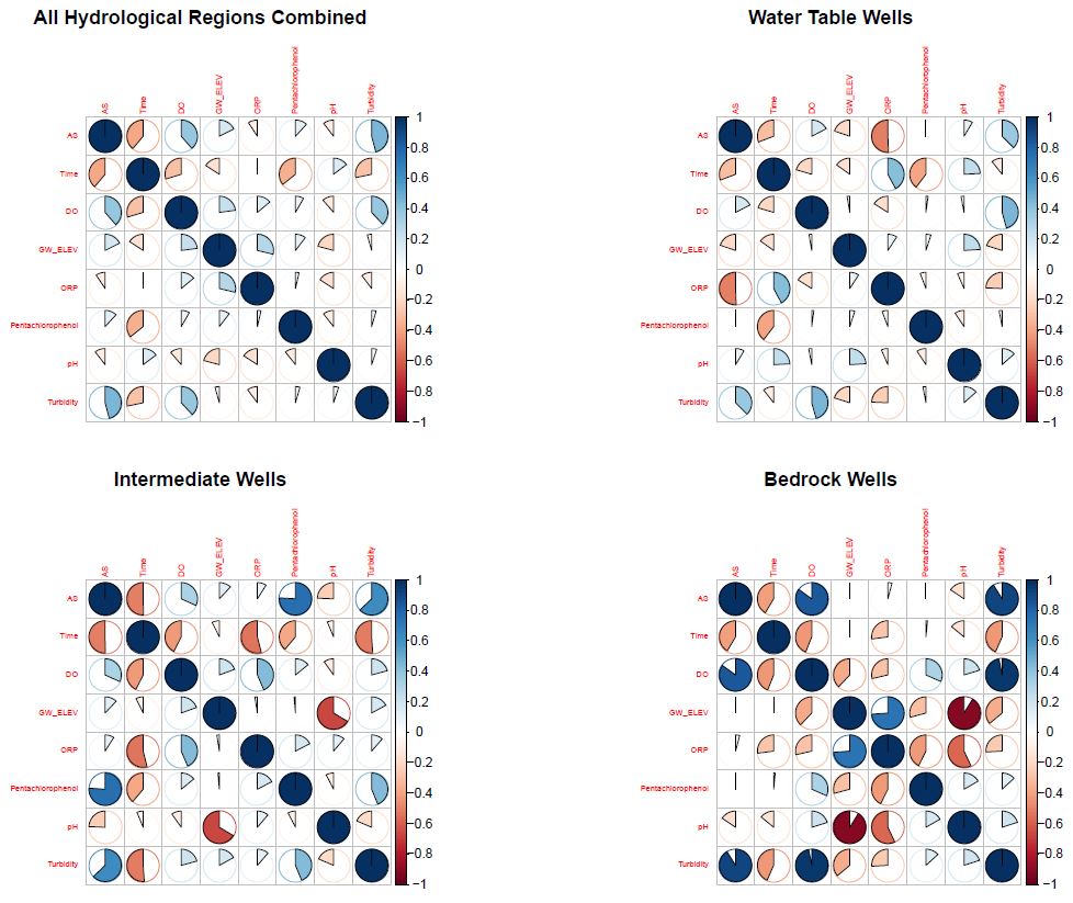
A look at arsenic’s correlation with several other variables.

Interactive Visualizations

Interactive visualizations can be presented in PowerPoint, HTML files, or in HTML slide presentations, allowing the user or presenter to interact with the data in real time.

An Interactive Time Series of COVID-19 Data in the US

Hover the plot to activate the toolbar, filter the data by double-clicking in the legend to select a location,and using the Ctrl key + click to select multiple locations to compare.

conData<-fread('https://raw.githubusercontent.com/CSSEGISandData/COVID-19/master/csse_covid_19_data/csse_covid_19_time_series/time_series_covid19_confirmed_US.csv')

dData<-fread('https://raw.githubusercontent.com/CSSEGISandData/COVID-19/master/csse_covid_19_data/csse_covid_19_time_series/time_series_covid19_deaths_US.csv')

cdata<-conData %>% 
  select(7:ncol(.)) %>% 
  gather(Date,Result,8:ncol(.)) %>% 
  mutate(Parameter = 'Confirmed Cases')

ddata<-dData %>% 
  select(7:ncol(.)) %>% 
  gather(Date,Result,8:ncol(.)) %>% 
  mutate(Parameter = 'Deaths')

gdata<-bind_rows(cdata,ddata) %>% 
  mutate(Date = as.Date(Date,format='%m/%d/%y')) %>% 
  group_by(Parameter,Province_State,Date) %>% 
  summarize(Result = sum(Result)) %>% 
  arrange(Parameter,Province_State,Date) %>% 
  as.data.frame(.) %>% 
  filter(#Parameter=='Confirmed Cases',
         Result>0 & Result != '')

n<-length(unique(gdata$Province_State))

g<-ggplot(gdata,aes(Date,Result,color=Province_State))+
  theme(plot.margin = margin(0.5,0.1,0.1,0.1,unit = 'in'))+
  geom_line()+
  theme(legend.position='None')+
  #scale_color_manual(values = rep('grey',n))+
  facet_wrap(~Parameter,scales='free')+
  labs(y='# of Cases',title = 'COVID-19 Cases through Time by State/Province')

ggplotly(g,width=800,height=500) %>% 
  layout(hoverlabel=list(bgcolor="red")) %>% 
  highlight(on = "plotly_hover")
Data Source: https://github.com/CSSEGISandData/COVID-19


A Basic Interactive Map using Leaflet JS via the R package leaflet

This is a very basic map, lots of interactive customization is possible with points, lines, and polygons, and the underlying attribute data. Maps can be embedded in HTML documents/presentations, websites, and PowerPoint presentations.

#Import data
maplocs<-read.csv('./data/maplocs.csv') %>% 
  unique(.)


#Render leaflet map
    m <- leaflet() %>% 
      addTiles(group="Roads") %>% 
      addProviderTiles('Esri.WorldImagery',group="Satellite") %>% 
      #addProviderTiles("CartoDB.PositronOnlyLabels") %>% 
      #setView(mCenter[2], mCenter[1],zoom = 1) %>% 
      #setMaxBounds(mBounds[2],mBounds[4],mBounds[1],mBounds[3]) %>% 
      addCircles(data=maplocs,lng = ~LONGITUDE,lat = ~LATITUDE,label = ~Location, labelOptions = c(permanent = TRUE),
                       radius = 8, group = "Locations",stroke = FALSE,fillOpacity = 0.8,  fillColor='#ed7000') %>%  
      addScaleBar(position='bottomright') %>% 
      # addMeasure(
      #   position = "topright",
      #   primaryLengthUnit = "feet",
      #   primaryAreaUnit = "acres",
      #   activeColor = "#3D535D",
      #   completedColor = "#7D4479",
      #   localization = "en"
      #  ) %>% #add measure
      
       addLayersControl(
         baseGroups = c("Satellite","Roads"),
         overlayGroups = c("Locations"),
         options = layersControlOptions(collapsed = FALSE)
       )
    
    
    m

An Interactive 3D Plot

Hover the plot to use the toolbars and move the plot around.

#Test 3d graphic

set.seed(42)
temp<-rnorm(100,mean = 30, sd = 5)
pressure<-rnorm(100)
time<-1:100

plot_ly(x = temp,y = pressure, z = time, type = "scatter3d",
        mode = 'markers', color = temp)

3D Surface

Hover the plot to use the toolbars and move the plot around.

z <- c(
  c(8.83,8.89,8.81,8.87,8.9,8.87),
  c(8.89,8.94,8.85,8.94,8.96,8.92),
  c(8.84,8.9,8.82,8.92,8.93,8.91),
  c(8.79,8.85,8.79,8.9,8.94,8.92),
  c(8.79,8.88,8.81,8.9,8.95,8.92),
  c(8.8,8.82,8.78,8.91,8.94,8.92),
  c(8.75,8.78,8.77,8.91,8.95,8.92),
  c(8.8,8.8,8.77,8.91,8.95,8.94),
  c(8.74,8.81,8.76,8.93,8.98,8.99),
  c(8.89,8.99,8.92,9.1,9.13,9.11),
  c(8.97,8.97,8.91,9.09,9.11,9.11),
  c(9.04,9.08,9.05,9.25,9.28,9.27),
  c(9,9.01,9,9.2,9.23,9.2),
  c(8.99,8.99,8.98,9.18,9.2,9.19),
  c(8.93,8.97,8.97,9.18,9.2,9.18)
)
dim(z) <- c(15,6)
z2 <- z + 1
z3 <- z - 1

fig <- plot_ly(showscale = FALSE)
fig <- fig %>% add_surface(z = ~z)
fig <- fig %>% add_surface(z = ~z2, opacity = 0.98)
fig <- fig %>% add_surface(z = ~z3, opacity = 0.98)

fig

Data Tables

Automate report results tables and formatting output to Excel.

Automate RMarkdown HTML documents with embedded tables.

Data-Linked Excel Tools

Most of us use Excel extensively. Modern Excel has lots of data source options such as Access databases, SQL Server, SharePoint lists, Oracle databases…

This makes it convenient to build analysis dashboards and tools right in Excel, with the data linked from a project database or other source.

A simple Water Level Transducer Project with Access and Excel

Data are maintained in Access with automated import of new monthly data files.

Data visualization and analysis features are built in Excel, always up to date with the linked Access database.


Automated Reporting

Template reports, including boilerplate text, tables and graphs. The report is generated from a data source, so periodic reporting such as monthly reports are updated each month with the new data. Inline text and calculations also can be programmed to change with the data.

Can be output to Word (static) or HTML (interactive) with formatting already applied.